Expert Guide: UX/UI Design Process
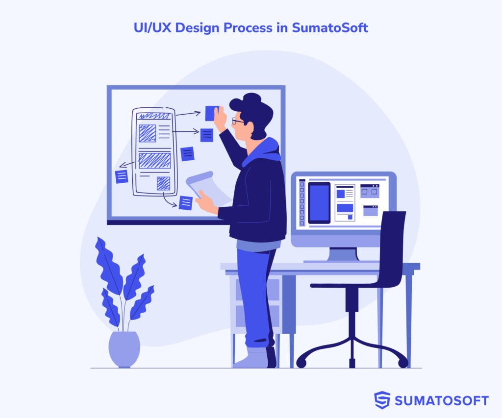

At SumatoSoft, our design process blends creativity, strategy, and user-centered thinking. During our cooperation in this phase, you can expect the same flow and artifacts you will see in this article.
The article is divided into two sections:
- Navigating the artifact landscape: The section explores business goals and specific design artifacts that help achieve them. An artifact is a tangible asset, such as a Figma file, or an Excel document, that contains valuable information for product development.
- SumatoSoft design process: The second section is devoted to describing the SumatoSoft design process step by step, with artifact explanations at every step.
Move to the next section with artifacts if you want to know more about the benefits every artifact provides.
If you want to learn more about the SumatoSoft design process, feel free to skip the section with artifacts and move directly to the section with the design process map.
How to Navigate the Artifacts
This section focuses on the artifacts we create during the design phase. It helps you identify which artifact to use depending on your business needs.
Here is how to approach the reading of statements for any artifact:
“I want to achieve goal #1, so I need to do action #1 – Ang get artifact #1 (at the #1 step at the design process)”
Once you identify which artifact you need, navigate to the corresponding step in the design process during which the artifact is produced.
- I want to outperform competitors, so I need to understand their strengths and weaknesses – Competitor analysis (Research and Discover).
- I want to develop an application that will resonate with my audience, so I need to know their needs and preferences – User personas (Ideate and Define).
- I want the app to be helpful to users, so I need to be aware of the tasks users want to accomplish – User story (Ideate and Define).
- I want the app to have intuitive navigation, so I need to map out the path users will take within the app – User flowcharts (Ideate and Define).
- I want the application to have the necessary features for users, so I need to define the functions of the application – Application functionality (Ideate and Define).
- I want to have clean, organized layouts, so I need to plan the UI element structure on every screen before start designing them – Wireframes (Ideate and Define).
- I want to set the visual and emotional tone for the design – Moodboard (Design).
- I want the app to have a modern aesthetic design, so I need to see several design concepts to choose from before designing the whole application – Mockups (Design).
- I want to see the design of all pages before moving to the development – User interfaces (Design).
- I want to test the app’s usability and functionality before developing it, so I need to build an interactive version of the app – A clickable prototype (Test).
- I want the product to make a great first impression on users, so I need to test the app with users and fix any issues before the release – Usability testing (Test).
- I want to maintain consistency in UI elements, so I need to have a collection of the smallest design elements that will be reused across pages – UI library preparation (Transition to Development).
- I want to guide my users effectively if an error occurs, so I need to know when something might go wrong and think through the messages the app sends to users – Successful scenarios and exceptions (Transition to Development).
Design Process Map
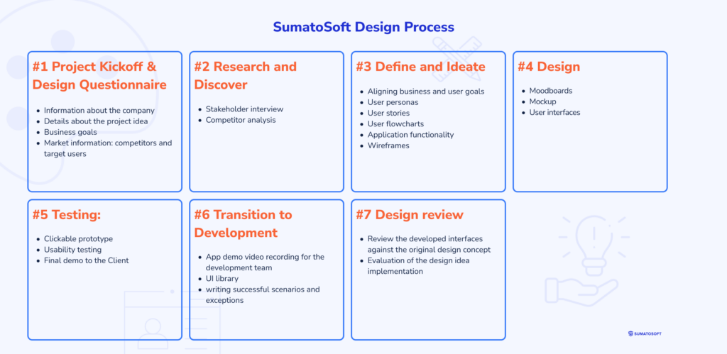
The picture above illustrates the steps of our design process and the key deliverables (or artifacts) produced at each stage. We follow the Agile methodology, which means that this process and the list of deliverables can be easily adjusted depending on the project’s needs.
The design process starts with a project kickoff.
#1 Project Kickoff & Design Questionnaire
The project kickoff is the official start of the project. Here, we gather the team, assign roles, discuss the initial scope of work, and start working on the project. We also send you a design questionnaire to gather detailed information about the project.
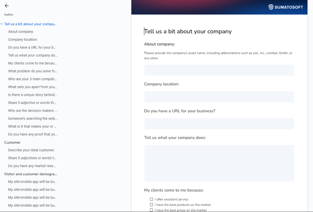
- Info about the company and design – contains questions about the presence of the design book, slogans, key decision makers for design, how users should perceive and feel about the application, what adjectives should be associated with the design, design preferences, etc.
- Info about the idea – what problem the application aims to solve, what makes the service unique on the market, etc.
- Info about business goals – what the expected result is, what success looks like, platforms the app targets, etc.
- Available info about the market (if it’s gathered) – competitors, market positioning, target users, etc.
This step provides the SumatoSoft design team with detailed information about your business, audience, market positioning, design preferences, and other aspects of the application that will guide the UI design and ensure your preferences are integrated into the final product.
#2 Research and Discover
The information provided in the questionnaire forms the foundation for the next step:
to clearly define and document business and user goals and align business and user requirements.
The essence of this step lies in the activities we perform and the artifacts we deliver:
- stakeholder interviews;
- competitor analysis.
Stakeholder Interview
The essence: regular or on-demand calls.
Goal: to gather valuable additional information for the design that wasn’t covered in the questionnaire and clarify specific requirements and needs.
When to use:
- Always. This is a crucial activity to ensure the final product meets business expectations.
When not to use:
- Avoid skipping this step if there is direct access to stakeholders.
Competitor Analysis
The essence: we examine competitor applications, either provided by you or researched by us. We assess their design, usability, functionality, online presence, pricing models (if applicable), etc.
Goal: to outperform competitors by understanding their strengths and weaknesses, unique propositions, strategies, etc. This helps to gain insights into what works in your niche/market and create a competitive advantage.
When to use:
- When entering a market with well-established players.
- When developing a new innovative product in a competitive market.
- When trying to outperform competitors with a specific offering.
- When rebranding or repositioning your product in the market.
When not to use:
- When entering a completely new or niche market without competitors.
- When developing a truly disruptive product.
#3 Ideate and Define
In this step, we ideate on and define the foundation for the future solution. It includes preparations of the following artifacts:
- user personas;
- user stories;
- user flowcharts;
- application functionality or scope of work;
- wireframes.
User Personas
The essence: we examine the demographic and personal traits of the target audience to develop a user archetype. A visual representation of user personas is often omitted, as a text description is typically sufficient for development.
Goal: to create a detailed representation of the target audience to better tailor the application to their needs, lifestyle, and preferences so that the application will resonate with them.
When to use:
- When building a new website or application.
- When targeting multiple user groups with varying characteristics.
When not to use:
- When targeting a very broad or generalized audience.
- When developing very niche products that solve highly specific problems.
User Stories
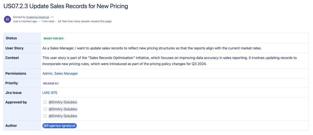
The essence: user stories are short, simple descriptions of a feature or function from the end user’s perspective. To develop them, we examine tasks that users would like to accomplish and write short stories that describe these tasks.
These tasks can take several forms: jobs to be done (JTBD), user stories, job stories, use cases, and scenarios. While they differ in form, they all serve the same purpose in the development process.
Goal: to define user tasks which, in turn, will help to identify the necessary functionality to achieve them.
When to use:
- When planning development after the design is complete, user stories serve as a valuable tool for describing the app’s functionality, which developers will use to program the app later on.
When not to use:
- For technical or backend-focused projects, such as parser or API development, where the focus is more on system-level tasks rather than user interaction.
User Flowcharts
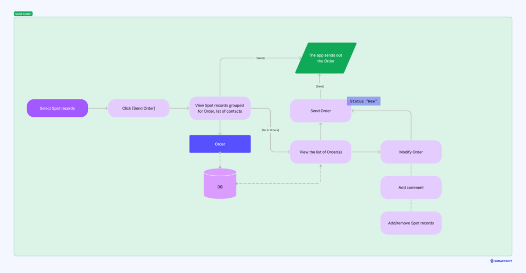
The essence: user flowcharts are diagrams that show the steps users take to achieve specific goals within an app. The diagram may illustrate a flow for a specific feature on one screen or represent a more global flow across the entire application. An alternative to user flowcharts is a user flow diagram, which is best used when multiple roles are involved in one flow and their integration matters.
Goal: to provide a clear visual representation of how users move through the application. Flowcharts help identify potential obstacles, improve the user experience, and optimize processes.
When to use:
- When designing complex scenarios with multiple steps, decisions, and branching paths.
When not to use:
- In projects with simple, straightforward, or short user scenarios.
Application Functionality
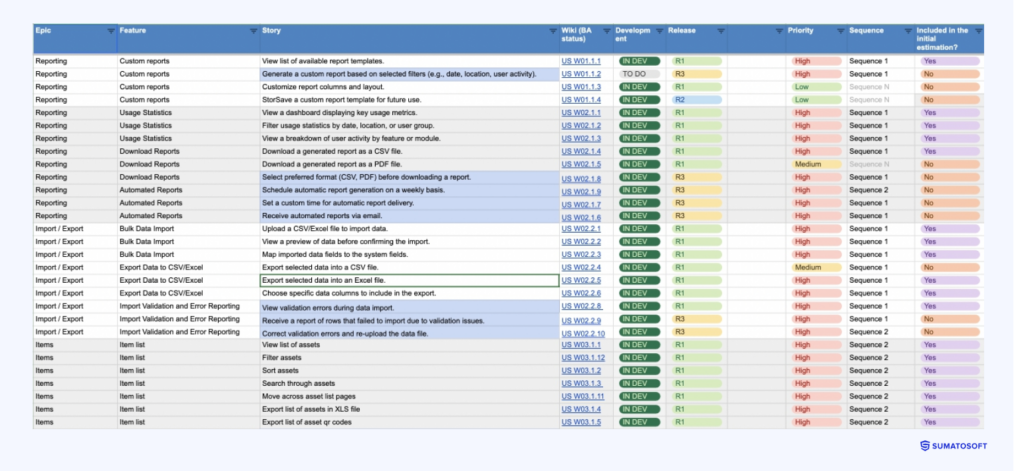
The essence: we prepare a list of stories, which are grouped into features. The features contribute to an epic, a high-level application asset, such as General UI, reporting, geolocation, admin panel, etc. The list of features is a backlog where we plan releases, track changes, and assign priorities.
Goal: to define and document the app functionality for further development.
When to use:
- When building a new website or application.
When not to use:
- In conceptual projects or exploratory stages where features are not yet defined.
Wireframes
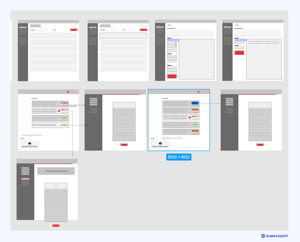
The essence: low-fidelity layouts with a focus on the content hierarchy, navigation, logic of user interactions, and placement of UI elements without designing them.
Goal: to organize UI elements on the interface before investing in the design. It ensures clean, balanced, cohesive and easily readable layouts.
When to use:
- When the user flows are complex and require preliminary prototyping to refine these flows.
- When there is no common ground among stakeholders on how the product should work.
- When you want to ensure users find the product easy to use.
When not to use:
- If the product has a well-known set of features and user elements. For example, when competitors have already designed interfaces and we need similar interfaces with the same features.
- When the deadlines are very tight, and there is no space for complimentary activities like prototyping.
#4 Design
The design stage is where ideas, user research, and competitor analysis come to life in the form of visually appealing and interactive user interfaces. This stage is focused on producing artifacts that define the final product’s exact look. During this stage, we prepare:
- moodboards;
- mockup;
- user interfaces.
Moodboards
The essence: a board of images that set the tone, style, and overall authentic of the product. The board may contain photographs, colors, fonts, interfaces from other applications, and other images that convey the emotion or style of the interfaces.
Goal: to define which emotions and feelings the design should trigger in users, like trust, excitement, calmness, energy, etc.
When to use:
- When you want to establish an emotional tone for the product.
When not to use:
- When the project’s primary concerns are funcitonality and usability rather than emotional reaction.
- When you have a brand book with style guides.
- Strict time or budget requirements.
Mockup
The essence: a mockup is a detailed representation of one application page closely resembling the final product. It includes design elements like layout, typography, colors, imagery, style, and content. Usually, we choose the home app page to prepare a single mockup or several mockup versions.
Goal: to provide a detailed, visually accurate preview of the final design so stakeholders can see how the product will look.
When to use:
- When you want to see a near-final design of a key page before designing others.
- When there are multiple stakeholders involved and their approval is required.
When not to use:
- When the visual identity isn’t really a significant aspect of the application. This is the case for data-heavy interfaces or applications with spreadsheets as main screens.
- When using a predefined template for interfaces.
User Interfaces
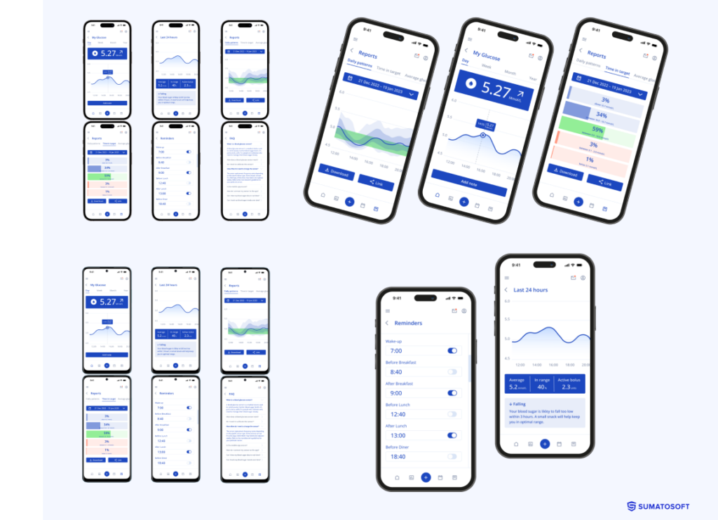
The essence: UI is the complete, polished version of the application’s visuals. Two scenarios are available here: we can prepare the user interfaces for all pages at once or do it gradually during development.
The main difference between these approaches lies in further flexibility – if interfaces are prepared upfront, significant changes in the requirements would also require changing the screens. We discuss and agree upon the preferred approach with you before processing the design.
Goal: to develop a final visual identity of the application.
When to use:
- When we agreed upon developing mockups. UI design will likely follow.
- When developing a new product with a unique design. The final UI is handed off to developers for implementation.
- When preparing marketing and presentation materials for investors, the design could be an additional artifact demonstrating your idea.
When not to use:
- The visual identity isn’t really an important part of the application, such as applications with data-heavy interfaces or spreadsheets as main screens.
- When using a predefined template for interfaces.
- For technical or backend-focused projects with little or absence of UI.
#5 Test
The test phase is focused on gathering feedback from both the business and final users regarding key app characteristics such as convenience, usefulness, usability, intuitiveness, etc. This process helps identify missing features, unexpected behaviors, and whether the interfaces are organized in a logical and easy-to-understand manner. Based on this feedback, we adjust the interfaces as needed.
Making changes during the design phase is significantly more cost-effective than redoing interfaces during production.
This step includes:
- developing a clickable prototype;
- conduct usability testing;
- the final design demo.
Clickable Prototypes
The essence: clickable prototypes are interactive screens of the application that users can click through and experience the flow like they are using the actual application. We use Figma to develop such prototypes.
Goal: to create interactive screens for testing on real users and adjusting the interfaces, app logic and functionality based on their feedback. The main advantage of clickable prototypes is that they are much easier to understand and engage with than static designs.
When to use:
- For marketing and demo purposes. Clickable prototypes are a very powerful tool for demonstrating the application concept to investors.
- When you have access to your potential customers and want to gather their feedback.
- When long-term cost efficiency is a top priority. Preparing clickable prototypes requires resources, but they can save significant time and cost during development by avoiding expensive revisions later.
When not to use:
- When your project is straightforward with minimal user interaction, static interfaces could suffice.
- When deadlines are tight, and there is no space for additional activities.
- When the design has already been approved and there is no space for making changes.
Usability Tests
The essence: usability testing involves engaging actual users in testing the design. In theory, it requires gathering a focus group and presenting them with a clickable prototype. The designer observes how users interact with the prototype and whether it’s clear to them how to complete specific tasks with the app’s help.
However, businesses rarely refer to this measure due to time and budget constraints or the absence of direct access to customers. Still, we came up with a good alternative that could be used when the project development starts.
We offer to deploy a marketing environment during development. It’s a separate app version with only well-tested features and completed user flows, so you can demonstrate the product to your customers and use it as a selling tool even before development ends.
Goal: to develop a better product by validating the design decisions on real users and uncovering usability issues. Products that undergo usability testing are usually more competitive in the market after launch.
When to use:
- When you have a direct access to your customers.
- When multiple users are already waiting for the app release, and the first impression is crucial.
When not to use:
- When developing an application with little interaction and without complex user flows.
- When you’re struggling to find reasons to run usability tests, it’s likely you can skip them.
Final Demo
The essence: we regularly run demos of the word done, but this demo is especially important for the development. We present user interfaces or a clickable prototype (if prepared) and ask for feedback. We encourage our Clients to carefully review the user interfaces and be actively engaged in this demo since the application will be based on this design. From this point onward, the time and cost of making changes to requirements or design will increase.
Goal: to gather feedback from the business, validate design decisions, and ensure the product is on track with business expectations.
When to use:
- When the design or clickable prototypes are ready for review.
When not to use:
- This is a mandatory step when we develop a design for the project.
#6 Transition to Development (Handoff)
Developers need to understand how to translate the design into code clearly. To ensure the design layouts are implemented exactly as planned by the design team and you, the design team does the following:
- App demo video recording for the development team;
- prepare UI library;
- write successful scenarios and exceptions.
UI Library
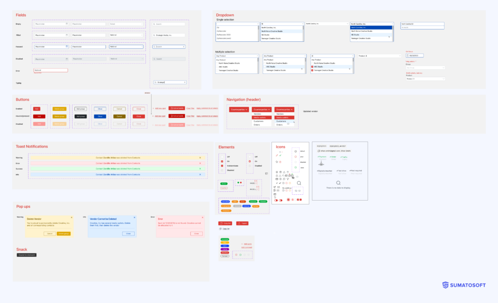
The essence: It’s a collection of the smallest design elements such as buttons, forms, icons, warnings, notifications, etc. They will be reused multiple times across all pages of the application.
Goal: to ensure a consistent user experience across all pages and speed up the development. The developers can program these little components at the beginning of the project and then call them from the necessary places.
When to use:
- When developing a unique design.
- When several developers are engaged in the development.
When not to use:
- When developing an application using another UI library.
- When you have a style guide with predefined UI elements.
- When a single developer is working on the project.
Successful Scenarios and Exceptions
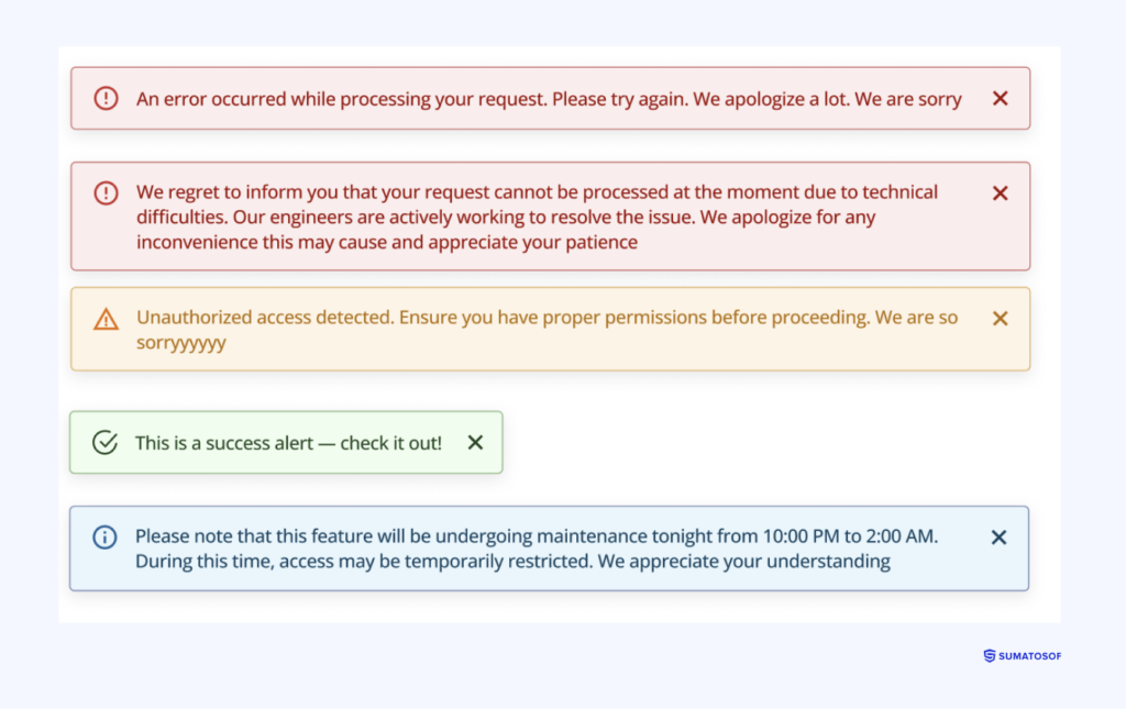
The essence: we define successful scenarios and exceptions to ensure the system behaves consistently whether everything is good or something goes wrong. Special attention is given to exception messages, ensuring the system provides clear and easily understandable responses to users.
Goal: to ensure the system provides a smooth user experience under normal conditions and in case of errors or disruptions.
When to use:
- When the application handles complex workflows with multiple potential failure points.
- When dealing with sensitive tasks like money transactions, healthcare data processing, emergence response systems, complex import, etc.
- When the product needs to comply with regulations and ensure every possible scenario is counted.
When not to use:
- When developing a simple product or MVP.
- When there is no sensitive data or critical operations involved.
#7 Design Review
The designer’s work doesn’t end once the design is handed off to development. Designers may periodically check and review the developed interfaces to ensure the developers adhere to the initial design concept and follow the design requirements.
This step ensures that the application’s visual aspect remains true to its original concept.
Afterwards
The approach described is flexible and agreed upon with you at the beginning of the design phase. The exact list of artifacts may vary depending on the timeline, budget, project complexity, and business goals.
This document is not intended to persuade you to invest in all of these artifacts but to encourage you to explore the available options and choose those that offer the most value to your business and project success.
We understand that finding a common language with specialists can be challenging. We hope this document has helped you better understand our design process and the terminology we use.
Thank you for reading!
Let’s start
If you have any questions, email us info@sumatosoft.com
