Case Study: Building a corporate website for a software company on WordPress
This case tells about the redesign of our corporate website: sumatosoft.com.
Our corporate website was built on top of the Webflow CMS in 2019. It contained several contact forms, about 25 landing pages, a portfolio, and a blog.
Business сhallenge
This case tells about the redesign of our corporate website: sumatosoft.com.
Our corporate website was built on top of the Webflow CMS in 2019. It contained several contact forms, about 25 landing pages, a portfolio, and a blog.
We also had a brand book and a concept for the future website design. The concept was as follows:
- Stringent colors over vivid colors.
- Unobtrusive animation.
- A clear, recognizable brand identity that we will use in marketing materials like banners and blog images.
- Our logo resembled the HTML5 logo a lot. We wanted to redesign the logo to distinguish it more clearly from the HTML5 logo.
- There must be an easily customizable visual element that we can use on various pages.
Our solution
We built our new corporate website on top of the WordPress CMS.
The development contains two stages.
In the first stage, we redesigned the blog and moved its administration to WordPress. So the marketing team got an opportunity to keep doing content marketing and article SEO. These types are the main blog page, article page and author page.
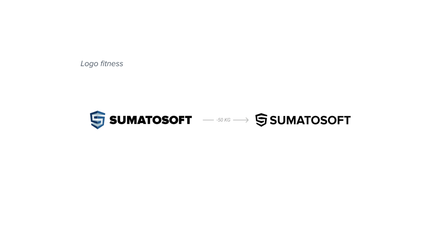
The second stage was about 6 months later. We designed and developed custom blocks for landing and main pages. Our designers started with a logo by making it thinner and shifting from blue to black shades.
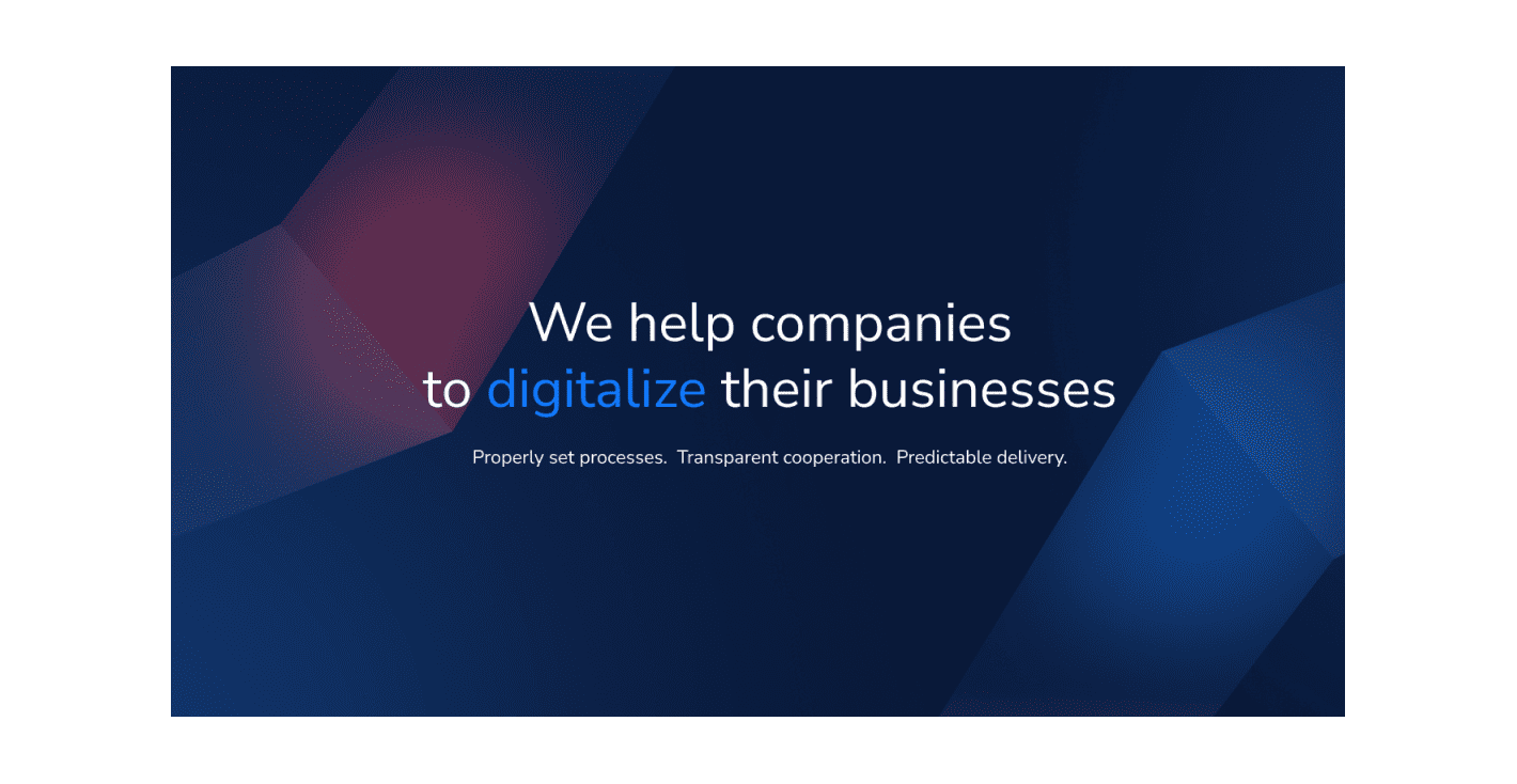
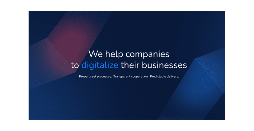
To get a visual element that can be reused on various pages, we decided to slice the logo into small pieces, rotate pieces, and reuse them on the background of some blocks. Thus, we get interesting geometric lines with angles and shades on the background.

When designing the home page, we decided to stick to an austere design:
- little gradient;
- no unnecessary visual forms and lines;
- grid usage for elements positioning.
We implied light animation on some screens and added the parallax effect to make the website look more dynamic. The hover animation was noticeable and didn’t look redundant or nerve-wracking.
We rework titles by making them more human-oriented, like “Services we can help you with” or “For 10 years now we have been responsible for your projects and we are proud of it!” We emphasized the section with case studies by expanding its size, showing the project tech stack, and adding a little description to every case. Thus we can tell users more about cases without making them visit the case study page. We also reorganized our contact form: we displayed steps of the further activities after form submission and added a file attachment option.
