
“If the statistics are boring, you’ve got the wrong numbers.”
That’s what Edward Tufte, a father of modern data visualization, once said. We will talk about his contribution and principles later.
Another good quote defines the impact of big data visualization very concisely and informatively.
A well-designed data visualization allows us to make essential decisions with absolute clarity.
I will share hands-on insights and knowledge about big data visualization from my company – SumatoSoft. In this article, I will guide you through the theoretical principles and rules of big data visualization to practical implementations.
Understanding Big Data Visualization
Big data visualization refers to the techniques and tools used to represent large datasets graphically. The aim is to highlight patterns, anomalies, and correlations within the data that might not be evident from raw data alone. By employing visual elements like charts, graphs, and maps, big data visualization enables users to grasp the significance of data at a glance.
Big data visualization is a form of knowledge compression. It’s a way of squeezing enormous information and understanding into a small space.
What Differs Big Data Visualization From Traditional Data Visualization
Big data visualization differs from traditional visualization in:
- Scope and scale. It addresses vast datasets beyond traditional tools’ capacity, focusing on volume, velocity, and variety.
- Complexity. It deals with real-time data streaming and dynamic aggregation, necessitating interactive, scalable visualizations.
- Tools and techniques. It employs sophisticated technologies, such as machine learning and complex event processing, for predictive analysis and handling of real-time data.
The concept of big data visualization was born because of the development of adjacent fields: the Internet of Things solutions, big data analytics, cloud computing, AI and Machine Learning, Data Science, Business Intelligence, and mobile computing. These fields generate enormous amounts of information that is impossible to process, store, analyze, and visualize using traditional methods and techniques.
Advantages: What Businesses Get from Big Data Visualization

Let’s consider advantages from the perspective of what businesses will get. By implementing big data visualization, businesses can:
#1 Present and Understand Data Better
Implementing big data visualization enables businesses to present complex datasets in an accessible format. As mentioned, well-designed data visualization allows us to make essential decisions with absolute clarity.
#2 Recognize Relationships and Dependencies
By visualizing data, companies gain insights into the complex relationships and dependencies across different areas, such as identifying how various elements within business operations interact. This comprehensive view supports informed decision-making and strategic planning, revealing hidden patterns and interconnections that can drive improvement and innovation across all aspects of the business.
#3 Find Patterns at Scale and Make Predictions
Big data visualization tools allow the analysis of vast datasets to identify trends and patterns that would be impossible to discern otherwise. This capability supports predictive analytics, enabling businesses to anticipate market movements, customer behavior, and potential risks, making more informed decisions.
#4 Create Better Products and Services
Insights gleaned from big data visualization can inform the development of new products and services or the improvement of existing ones. Understanding customer needs and market trends through data visualization leads to more targeted and successful offerings.
#5 Provide Real-time Monitoring and Immediate Response
Monitoring operations, customer interactions, and real-time market changes is a significant advantage. Big data visualization facilitates immediate response to these dynamics, allowing businesses to adapt quickly to threats or opportunities.
#6 Detect Errors and Measure Risks
Visualizing data helps detect anomalies, errors, and potential risks early, safeguarding against financial losses and operational disruptions. Businesses can proactively address issues before they escalate by clearly showing where vulnerabilities lie.
#7 Optimize Resource Allocation
Big data visualization aids in identifying areas where resources can be optimized, leading to significant cost savings and enhanced operational efficiency. By understanding where investments yield the highest returns, companies can allocate their resources more effectively, ensuring optimal performance and profitability.
Types of Data Visualization
There are four distinct groups that serve different purposes and bring various benefits. The category names reflect the visualization goals: relationship, comparisons, compositions, and distribution. Each group offers a lens through which data can be analyzed and presented.
Relationship

Relationship visualizations focus on how data points relate, highlighting connections, correlations, or how one variable may affect another.
These visualizations are pivotal for uncovering complex interactions within the data, often utilized in scatter plots, bubble charts, and correlation matrices. They help identify how changes in one area could impact another, facilitating strategic decision-making.
Comparisons

Comparison visualizations enable the side-by-side analysis of different datasets or the same dataset over time. They are crucial for benchmarking, tracking performance against goals, or evaluating differences and similarities.
Bar charts, line graphs, and radar charts are standard tools for this type, allowing businesses to measure progress, identify trends, and make competitive analyses.
Compositions

Composition visualizations delve into how individual parts make up a whole, which helps understand the distribution or proportions within a dataset. They are precious for financial analysis, market share segmentation, or resource allocation.
Pie charts, stacked area charts, and bar charts are examples of visualization tools that help depict the makeup of a dataset, revealing insights into the structure and priority of different components.
Distribution

Distribution visualizations highlight how data is spread across different categories or over a range, helping to identify patterns, outliers, and clusters. This type is vital for statistical analysis, assessing variability, and understanding the breadth of data.
Histograms, box plots, and density plots are among the visualization tools used to examine the distribution, offering insights into the overall landscape of the data and guiding more informed decision-making.
An overview of all methods and charts:

What Charts Say, What Charts Mean, What Charts Do
This phrase encapsulates three fundamental aspects of data visualization and its impact on communication and decision-making. Each part highlights a different dimension of how charts (and, by extension, all forms of data visualization) function within the realm of information dissemination and interpretation.
Here’s a breakdown:
What Charts Say
This refers to the explicit information or data that charts present to the viewer. It’s about the direct, surface-level communication of facts and figures. “What Charts Say” is concerned with the accuracy and clarity of the data being represented, focusing on the ability of the chart to convey specific details of the dataset it’s visualizing.
It’s the first level of interpretation where viewers understand the basic data points, trends, or comparisons being made.
What Charts Mean
Moving deeper, “What Charts Mean” explores the interpretation of the data presented by the charts. It’s about understanding the implications, insights, or conclusions that can be drawn from the visualized data.
This level involves analytical thinking, where viewers synthesize the information displayed to derive broader meanings or insights. It’s where data visualization helps transform raw data into actionable knowledge, highlighting patterns, anomalies, or correlations that inform decisions or strategies.
What Charts Do
Finally, “What Charts Do” addresses the effect or impact of charts on the audience and decision-making processes. This aspect examines how data visualizations influence viewer perceptions, behaviors, or decisions. It’s about the power of charts to persuade, motivate action, or alter understanding.
Example
Let’s consider a financial chart displaying the quarterly revenue growth of a company over the past five years, a common visualization in the finance sector.
- Charts say: the chart explicitly shows the quarterly revenue figures for each quarter over the last five years.
- Charts mean interpreting the chart, and analysts and investors notice patterns or trends in the company’s financial health. For instance, the chart shows a consistent upward trend in revenue growth. This could imply effective management, strong market demand for the company’s products, or successful entry into new markets.
- Charts do: investors and stakeholders consider the trend as positive. Stakeholders become confident that the chosen strategy works and invest more money in strategic activities, while investors are encouraged to increase their stakes in a company that’s clearly thriving.
Together, these three aspects provide a comprehensive framework for evaluating data visualizations, emphasizing the importance of not just how data is presented but also how it’s interpreted and the effects it has on its audience. They remind us that charts are not just tools for showing data but powerful instruments of communication that carry meaning and have the potential to drive change.
Tufte’s Principles of Data Visualization
We are approaching the core part of this article – how to implement data visualization. One topic still needs to be covered, which is Tufte’s principles of data visualization.
Edward Tufte, a pioneer in the field of data visualization, has contributed significantly to how we understand and present data graphically. His principles of data visualization are grounded in the belief that visual displays of information should promote clear communication and effective analysis. There is a nice phrase that describes these principles very well in a concise manner:
Data visualization isn’t about simply showing the numbers. It resides at the intersection of Mathematics, Science, Psychology, and Design.
Here’s an overview of some key principles he advocates:
- Maximize data-ink ratio. Tufte emphasizes the importance of minimizing non-essential ink that doesn’t convey information, advocating for simplicity and clarity in data presentation.
- Avoid Chartjunk. Tufte introduces the concept of “chartjunk” to describe all unnecessary or distracting decorations in graphs and charts that do not improve the viewer’s understanding. This principle aligns with maximizing the data-ink ratio by encouraging the removal of extraneous visual elements.
- Integrate words, numbers, and images. Tufte suggests that graphical and textual elements should be integrated seamlessly. Annotations, labels, and explanatory text should complement each other to tell a coherent story, with visual explanations closely aligned with the data.
- Comparison. Visualizations should facilitate comparison, as understanding often comes from being able to compare different datasets, variables, or time periods. Tufte encourages the design of graphics that make these comparisons intuitive and straightforward.
- Focus on content. Above all, Tufte values content integrity. Data visualizations should be designed to serve the content’s needs, presenting information honestly, accurately, and in a way that respects the data’s complexity.
How to Use Big Data Visualizations: Guide with Tips

Step #1: Define Your Objectives
Before diving into the data, it’s necessary to understand the desired results of big data visualization.
- Are you trying to identify trends?
- Do you want to compare data sets?
- Do you need to illustrate relationships?
- Or do you plan to communicate findings to a specific audience?
Defining your objectives upfront guides every subsequent decision in the visualization process, from the type of data you need to the best way to present that data. This initial clarity ensures that the final visualization is relevant, focused and aligned with your strategic goals or the specific insights you wish to convey.
This step sets the foundation for your visualization project, ensuring that all efforts are aligned with a clear purpose.
Step #2: Understand Your Data
Once your objectives are defined, the next crucial step is to deeply understand the data you’ll be working with. So, explore the dataset!
Get familiar with the structure of your data. Identify the types of data you have (e.g., numerical, categorical), understand the variables and their relationships, and get a sense of the scale and scope of the data.
Additional Hints:
- Evaluate the quality of your data by looking for any inconsistencies, missing values, or potential outliers.
- Determine which data points are most relevant to your objectives. Not all data will be equally important for your analysis, so identifying the key variables early can streamline the process.
Step #3: Clean and Prepare the Data
Cleaning means addressing any issues identified during your data assessment. This may include filling in missing values, correcting inaccuracies, removing duplicates, or dealing with outliers. Ensuring your data is clean and accurate is essential for meaningful visualizations.
Preparing means transforming data into a more usable format. This could involve aggregating data points, creating new variables from existing ones, or normalizing data for comparison.
Additional Hints:
- Consistency in data formats (dates, currencies, etc.) across your dataset is crucial for accurate analysis and visualization. Standardizing these formats ensures that your visualizations will be coherent and interpretable.
Step #4: Select the Right Visualization Tools
In the past, data visualization was primarily a manual process, relying on physical tools such as rulers, dividers, and protractors.
Nowadays, we have plenty of sophisticated digital tools that do all the hard work for us. They perform calculations, aggregation, and transformation, automatically create visual elements and charts, and provide tools for quick data filtering, sorting, and zooming. They have integration with various data sources, databases, spreadsheets, cloud services and much more!
Visualization has never been so simple! And so complex at the same time…
The point is that it’s quite simple to visualize data with the help of these tools. It’s the knowledge, expertise, and skill in understanding which data to visualize and what the core variables are that come first.
That’s why many businesses prefer to refer to professional data analytics service providers such as SumatoSoft. We specialize in IoT development, which requires comprehensive knowledge and expertise in big data handling and visualization. So, we have 14 years of expertise to offer.
We also wrote an article about the best data visualization providers – feel free to check it.
Still, speaking about the tools themselves. Some of them are:
- Jupyter Notebook. An open-source web application that allows you to create and share documents containing live code, equations, visualizations, and narrative text.
- Tableau. A powerful data visualization tool that enables users to create interactive and shareable dashboards.
- Google Charts. A web-based tool that provides a wide variety of charts that are easy to embed in web pages.
- Looker. Now part of Google Cloud, Looker supports data exploration and insights by providing data analytics and business intelligence capabilities with strong visualization components.
- Hadoop and Spark. Frameworks designed for storing and processing big data in a distributed computing environment. While not visualization tools themselves, they are essential for managing and preparing large datasets for visualization.
- Power BI. A business analytics service by Microsoft that provides interactive visualizations and business intelligence capabilities with an interface simple enough for end users to create their own reports and dashboards.
- D3.js. A JavaScript library for producing dynamic, interactive data visualizations in web browsers, offering great flexibility and control over the final visual presentation.
Step #5: Choose Appropriate Visualization Types
After preparing your data and selecting your visualization tools, the next step is choosing the most appropriate visualizations for your objectives.
This is the core decision to be made since the interpretability and impact of the data directly depend on the visualization type.
As I’ve mentioned, there are 4 scenarios that differ based on the goal of your visualization:
- show the relationship between variables;
- compare variables or datasets;
- display the composition of some datasets;
- show the distribution of some datasets.
That’s it. If you consider every scenario to ben’t suitable for your case, you are likely deluded. I recommend returning to the first step.
Step #6: Customize The Visualization
There is nothing general to say here since digital tools do everything for you. Instead, I want to share several tips on how to visualize the data effectively:
- Employ color strategically to highlight important data points, differentiate between data sets, or categorize information. Don’t paint your visualization, we are not artists.
- Opt for simplicity in your visual design. Complex data does not necessitate complicated visualizations.
- Adhere to Tufte’s principles.
- Ensure that the scales used in your visualizations are consistent, especially when comparing multiple charts or graphs. Inconsistent scales can lead to misinterpretation of the data.
- When using bar charts or related visual types, start your axes at zero to avoid misleading representations of the data.
- Choose scale types that match your data distribution. For example, linear scales are suited for uniform data, while logarithmic scales can better represent data that spans several orders of magnitude.
- Always use legends to explain your data.
- Use annotations wisely.
- Use the white background – it’s easier to read and make emphasis on some data with colors.
- Use a light color for gridlines.
Step #7: Gather Feedback and Refine Visualization
Once the data is visualized, ask colleagues, superiors, subordinates, friends, or parents to look at it and tell what they see.
This step isn’t about whether they like your visualization or not.
It’s about whether you convey your message with visualization or not.
Ask them 3 core questions:
- What is this visualization about?
- What’s your takeaway from this visualization?
- If you were *place here your target audience*, what would you do after looking at this chart?
Refine the visualization in case the feedback shows you don’t convey the desired message.
Gathering feedback is not a one-time task but an ongoing part of the data visualization process. It ensures that your visualizations not only look good but, more importantly, effectively communicate the intended message, are accessible to everyone, and facilitate the right insights and decisions.
How SumatoSoft Visualizes the Data
The majority of projects we undertake require data visualization services. Our core expertise lies in IoT software development services that require big data visualization competence. We deliver custom enterprise software and develop MVPs for startups to gain a competitive advantage and improve their efficiency, effectiveness, and profit. Here are some of the recent cases we made:
A Platform For Vital Farm Animals Sign Monitoring
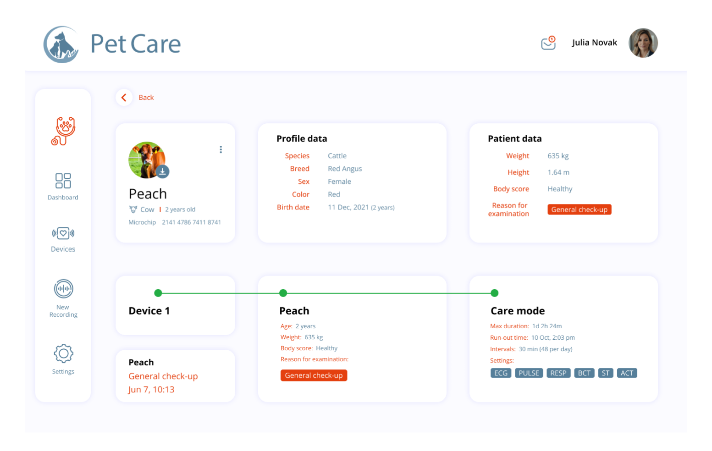
The Client is a MedTech start-up from the EU that aims to enhance veterinary medicine by helping veterinarians and farmers easily get an overview of an animal’s ECG, respiratory, pulse, and other supporting data for diagnoses.
Together with the Client’s experts, we have developed an Internet of Things platform for data gathering, visualization, analytics, diagnosis and calculation. These data are recorded in a raw format from the sensors and are sent over to the web as Mqtt-Messages.
Mobile Application for 24/7 Blood Glucose Monitoring

Our Client is a North American healthcare technology firm that specializes in manufacturing sensors for blood sugar monitoring targeted at individual consumers. The sensor is an innovative device that is different from the usual glucometers. It is embedded under the skin into the patient’s arm, and the blood sugar level is continuously monitored.
We established a 24/7 real-time monitoring system that continuously receives sensor data and displays it in the app through detailed charts and tables.
Clinical Trial Matching Platform

In the United States, the process of patient recruitment for cancer clinical trials is a critical yet challenging task. Traditionally, it involves clinicians manually screening patients to find suitable matches for trials, a process that requires in-depth knowledge of complex enrollment criteria, including clinical, radiologic, and genomic data. This manual approach is time-consuming and often inefficient.
The Client, a company operating in the healthcare sector, recognized the need for improvement in this area. Their objective was to accelerate patient recruitment by introducing an AI-based, automated screening tool. This tool is designed to determine patient eligibility for clinical trials quickly and accurately, aiming to reduce the workload on clinicians and streamline the process for both patients and healthcare providers.
SumatoSoft developed a comprehensive solution for the Client, encompassing an integrated platform that links with the ClinicalTrials.gov database. This platform features a dual-component system: a web dashboard for sponsors to manage clinical trials and patient engagement and a mobile application for patients, facilitating the search for suitable clinical trials.
Some Facts About SumatoSoft
- We strive for quality and security, and ISO 27001 and ISO 9001 certificates can prove it.
- We focus on long-term cooperation. 70% of our Clients come back to us with another project.
- Our Client’s satisfaction rate is 98%, thanks to our firm commitment to deadlines and their needs.
- Your project data stays safe. We guarantee the security of all data related to your project.
- We only release the software if it meets the specified percentage of acceptance criteria. The percentage is agreed upon with you in the quality assurance strategy.
- 70% of our team is senior-level developers and QA engineers who ensure the app complies with domain best practices and our inner quality assurance guidelines.
Nectarin LLC aimed to develop a complex Ruby on Rails-based platform, which would be closely integrated with such systems as Google AdWords, Yandex Direct and Google Analytics.
We were looking for a professional outsourcing company to extend our in-house team and help us to solve difficult technical problems.
We hold a large-scale tender to select a partner. Even at the tender stage, SumatoSoft team showed a desire to go deep into our project and suggested an architectural solution we liked. Other bidders, including top Moscow Ruby on Rails agencies, showed much less interest, sending formal business proposals with prices for their services. Therefore, we started to work with SumatoSoft.
SumatoSoft team not only knew well how to build a partnership-based working process, but also offered sensible suggestions and advice helping us to reach the long-term business goals.
We are completely satisfied with the results of our cooperation and will be happy to recommend SumatoSoft as a reliable and competent partner for development of web-based solutions.

The SumatoSoft team has built 250 custom software solutions for 27 countries and 11 industries. After more than 12 years on the market, the company became a reliable technical partner to its Clients, demonstrating a 98% Client satisfaction rate with the quality of services they provide.
Contact us to get a free quote for your project.
Afterwards
The essence of successful data visualization lies in its clarity, insightfulness, and ability to drive action. Through careful preparation, thoughtful design, and responsive feedback, visualizations transcend mere data presentation to become powerful narratives that inform and inspire.
As we blend the art and science of visualization, remember that the goal is to illuminate the stories hidden within data, guiding decisions and sparking change. With the guidelines and tips shared, you’re equipped to uncover and share these stories, making data seen, understood, and acted upon.
Let’s start
If you have any questions, email us info@sumatosoft.com


